I’m thrilled to introduce Alain Voinot from France as this month’s guest blogger! Back in March, I featured one of his stunning works, and I’ve been captivated ever since by his remarkable ability to use black (or dark) paper as a foundation for breathtaking landscapes.
Working on black paper requires a unique mastery. While it beautifully enhances vibrant colors, it presents a real challenge for lighter, more subtle tones—especially in landscapes. Though I’ve dabbled with black paper myself, my attempts so far have left me longing for the finesse Alain brings to this medium. His expertise is undeniable, particularly in crafting lush, green landscapes that seem to spring to life from the dark background. It’s nothing short of extraordinary!
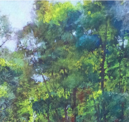
Have you encountered Alain Voinot’s work yet? If not, here’s a piece to inspire you:
Alain Voinot, “Arrival,” pastel on black Canson Mi-teintes paper, 25 x 19 in
A Bit About Alain Voinot
Alain Voinot’s journey as an artist began with a thirst for philosophical and artistic discovery, which led him to travel extensively, particularly in India. Upon returning to France, he honed his skills in documentary drawing, focusing on black-and-white techniques under the guidance of the renowned engraver Catherine Escudié and at the prestigious Toulouse Academy of Drawing.
When Alain transitioned to working with color, pastels became his medium of choice, seamlessly blending the precision of drawing with the richness of dry painting. For a decade, he shared his expertise by teaching in various associations and institutions before fully dedicating himself to his artistic career.
Alain’s work has earned him numerous accolades at pastel exhibitions and salons. In 2014, he was honored with the “Prix de la Ville de Saint Aulaye for Tonalities and Colours” at the celebrated Pastel en Périgord exhibition in France, judged by Master Pastelist Michel Bordas. His art continues to captivate audiences, showcasing his extraordinary skill and passion for the pastel medium.
And now I hand you over to Alain Voinot!!
Alain Voinot – Illuminating Landscapes on Black Paper
I reside in the vibrant city of Toulouse, in the south of France, but my true inspiration lies beyond the urban landscape. Just 10 kilometers from the city, I find my creative sanctuary in the Parc du Confluent, a stunning natural reserve where the Garonne and Ariège rivers converge.
For me, water is the soul of the landscape—a subject I never tire of exploring. Its ever-changing nature captivates me, from its shimmering transparency to its enigmatic opaqueness, and the way it dances under the play of light. Each nuance tells a story, and through my art, I aim to capture its essence on the dramatic backdrop of black paper.
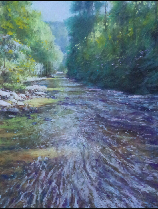
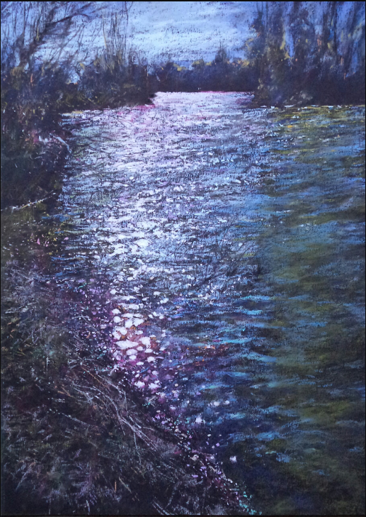
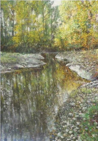
Alain Voinot, “River with Dimming Light”
Pastel on brown Canson Mi-Teintes paper, 25 x 19 in.
In “River with Dimming Light,” Alain Voinot masterfully brings water to life as the focal point of the composition. The river in the foreground shimmers with the interplay of light and movement, capturing its dynamic and ever-changing nature. Voinot’s delicate use of light reflections conveys the river’s fluidity and vitality.
To enhance the sense of depth, he skillfully incorporates shades of blue in the background, creating a serene yet evocative depth of field. This piece beautifully showcases Voinot’s ability to translate the essence of water into a harmonious interplay of light and color.
Finding My Style: Pastel on Black Paper
Throughout my artistic journey, I’ve discovered my signature style in working with pastels on black paper. I’m drawn to the bold contrasts that this medium offers, as the dark background allows the light to shine through with striking intensity. To achieve this, I often use the smooth side of Canson Mi-Teintes paper, which provides the perfect surface for my technique.
One of the unique qualities of pastel is its ability to harmonize the paper’s color with the overall composition. By using black as my base, I can emphasize the interplay of color and light directly, rather than relying on black as a shading element. This approach enables me to create pieces that are rich in depth, vibrancy, and dramatic contrast.
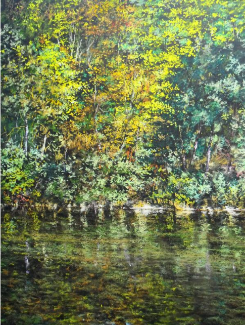
Alain Voinot, “The River in Orlu,” pastel on black Canson Mi-teintes paper, 19 x 15 in. I worked here on the contrast of yellow and blue. For once I did not use many greens.
The Two Phases of Pastel Creation
In my view, creating a pastel artwork involves two distinct phases. The first is the intuitive phase—a moment of spontaneous inspiration where the essence of what one wants to express must be captured quickly and decisively. It’s about understanding the soul of the scene and translating that into the initial strokes.
The second phase focuses on refinement and finishing. This is where the black paper truly shines, as its natural darkness can be used to subtly shape shadows and enhance depth. The challenge lies in striking the perfect balance—allowing the paper’s black to interplay with the colors without overwhelming them. It’s a delicate dance of preserving bold contrasts while letting the light breathe through the composition.
Here’s a piece I created en plein air, with a step-by-step photographic journey documenting its evolution.
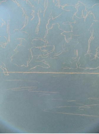
Setting up, very fast and very simple with a color that stands out a bit of the color of the paper. I used a hard pastel – Conté.
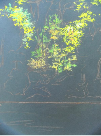
To obtain immediately a very strong contrast I started in the central part – trees in light.
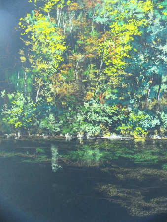
To further highlight the trees in light, I worked the trees on the right and left side which are darker.
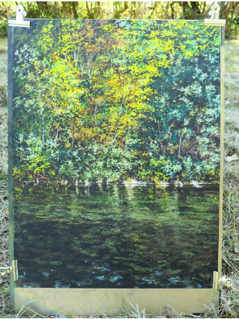
Working the water …
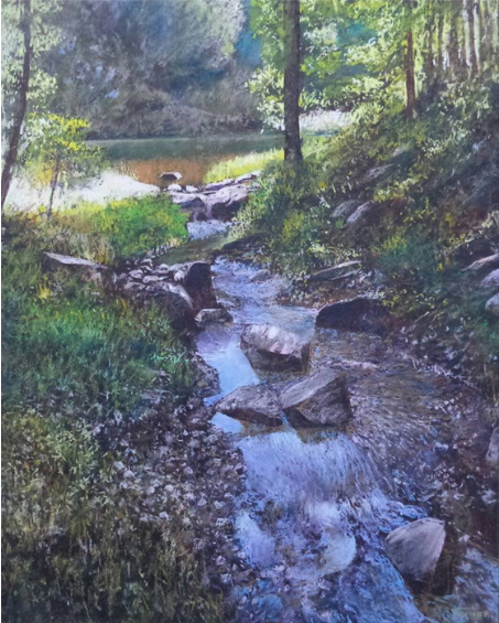
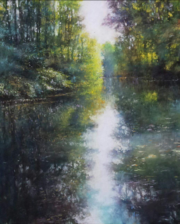
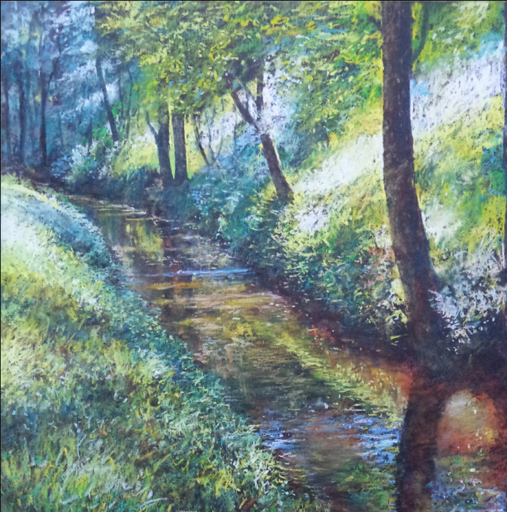
Alain Voinot, “Along the River”
Pastel on black Canson Mi-Teintes paper, 25 x 19 in.
In “Along the River,” Alain Voinot brings a serene landscape to life with his signature use of pastels on black paper. The finished piece showcases his remarkable ability to accentuate every detail, enhancing the vibrancy of the trees and the dynamic reflections on the water.
Voinot pays special attention to the shoreline, where the bright contrast between the water and the trees becomes a striking focal point. This sharp separation not only defines the composition but also highlights his mastery in balancing light and color against the rich, dark background. The result is a luminous, captivating scene that draws the viewer into its tranquil beauty.
The Power of Contrast: Working on Black Paper
Working on black paper has been instrumental in deepening my understanding of contrast. It provides a striking foundation for bringing light and color to life, but my exploration doesn’t stop there. I also enjoy working on light or dark-toned paper, often using Pastelmat or Pastelcard for these pieces. This specialized surface allows for stunning gradients and a finish reminiscent of oil painting.
For darker areas, my process begins with a dense black Rembrandt pastel, applied after the initial placement of colors. From there, I layer and modulate with various dark tones, creating depth and texture. I’ve created many pastels using this approach, and each one has further enriched my appreciation for the interplay of light, color, and contrast.
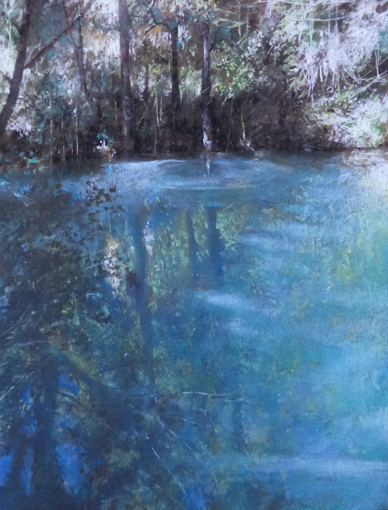
Alain Voinot, “At the Park of the Confluence,” pastel on black Pastelcard, 25 x 19 in
The Role of Paper and the Spirit of My Art
An essential principle I always consider in my work is the integration of the paper’s color into the composition. The paper serves as the foundational tone, influencing and harmonizing with all other colors applied. Allowing the base color to subtly emerge behind the pastel creates a sense of “breathing” within the piece, giving it depth and vitality.
In terms of style, I identify as an Impressionist, though more precisely, my approach can be described as “realistic fantastic.” Every artwork is ultimately an interpretation of what the artist perceives, offering a personal vision of the world. For me, art is a journey to uncover the mystery and beauty of life, striving to faithfully convey what I “see.”
My perspective merges realism with poetry, as I believe that the two must coexist. Poetry imbues realism with depth and warmth, while realism grounds poetry, giving it structure and truth. It is this synthesis—balancing the tangible with the poetic—that fuels my creative process and allows me to reveal the soul of the scenes I depict.
Alain Voinot, “Return of the Night”
Pastel on black Canson Mi-Teintes paper, 19 x 15 in.
In “Return of the Night,” the black paper takes center stage, serving as the perfect backdrop for a twilight scene approaching nightfall. The omnipresent darkness sets the tone, encapsulating the quiet, mysterious atmosphere of the hour.
To soften the dramatic effect of the black base, I layered subtle hues—yellows, mauves, greys, and oranges—adding depth and vibrancy to the composition. The reflections shimmer with a delicate interplay of colors, with only the luminous centers rendered in pure white, drawing the eye to points of light that punctuate the scene. This nuanced use of color brings balance and life to the piece, capturing the fleeting beauty of twilight.
Discovering Color through Light and Grey
My artistic journey began with black-and-white drawing, where I explored the nuances of greys to convey depth and subtlety. It was through this monochrome work that I truly understood the relationship between color and light. I realized that every color has its corresponding degree of grey, reflecting its lightness or darkness. This understanding was a turning point in my exploration of color.
The subjects that inspire me are often simple in composition but rich in complexity when it comes to light and texture. I’m particularly drawn to the concept of color temperature and frequently choose between warm or cool colors, depending on the mood I wish to evoke in each piece. This thoughtful use of temperature adds another layer of emotion and depth to my work, allowing the scene to resonate on both a visual and sensory level.
Alain Voinot, “Swamp at the Bottom of the Waterfall,” pastel on brown Canson Mi-teintes paper, 19 x 15 in. Here it is the blue colour (blue green, emerald blue) that dominates. Again, I gave a lot of importance to the water. In the background I used a dark green pastel and a black pastel, for marked contrasts.
I often walk in nature, for the pleasure of walking, but also to find new subjects. Many pastellists know that during walks we see beautiful landscapes, but also, and especially future pastels. However, I am convinced that a beautiful landscape does not always produce a beautiful picture. Also I prefer scenes that are more intimate, even anecdotal to the broad landscapes – ”the postcard landscapes.”
Here is another step-by-step. Also note the second version of the painting.
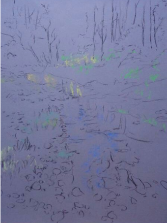
Setting up the black charcoal drawing on grey Canson Mi-teintes paper.
The first lights: sky and its reflection in the water. And I always work with the color of paper…
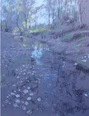
Working on the water
Moving along….
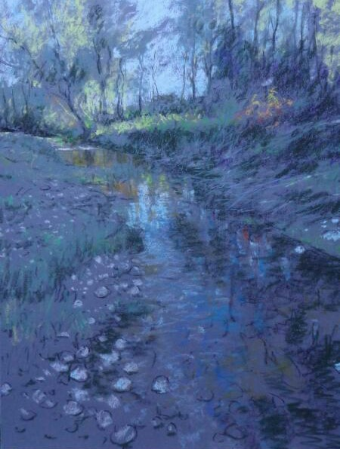
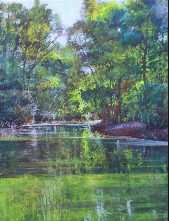
Alain Voinot, “At the Nature Park,” pastel on grey Canson Mi-teintes paper, 25 x 19 in.

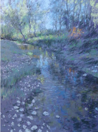
Alain Voinot, “At the Nature Park”
Pastel on black Canson Mi-Teintes paper, 25 x 19 in.
In “At the Nature Park,” Alain Voinot demonstrates how the choice of paper can dramatically influence the atmosphere of a piece. Here, the same composition is recreated on black paper, and the effect is immediately evident.
The dark background enhances the contrast between light and shadow, allowing the vibrant colors to stand out with striking intensity. The richness of the black paper deepens the tonal contrasts, lending the piece a dramatic, almost ethereal quality. This is a powerful example of how paper can shape the emotional impact and visual dynamics of a work, offering a distinct and powerful rendition of the same scene.
The Instinctive Use of Color in Landscape
My approach to color is deeply instinctive, rooted in immediate emotion and personal connection to the subject. As I often work with landscapes, one color that frequently presents itself is green. Green is often regarded as a challenging color to work with, sometimes thought of as “ungrateful” due to its ubiquity in nature. However, I’ve found ways to make green both interesting and expressive.
Rather than using a flat, uniform green, I explore its many variations—orange-infused greens, greyish greens, and even bluish greens—each of which adds layers of complexity and warmth. These subtle shifts in hue allow the green to retain its natural essence while taking on a more nuanced, dynamic character. This approach helps me bring new life and depth to landscapes that might otherwise feel one-dimensional.
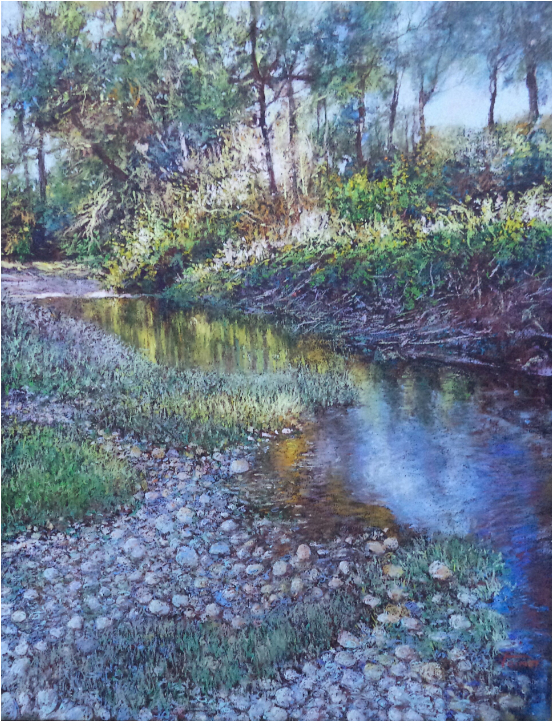
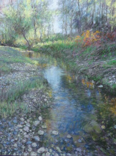
Alain Voinot, “Along the Stream”
Pastel on black Canson Mi-teintes paper, 19 x 19 in (square format).
In “Along the Stream,” Alain Voinot masterfully utilizes the full spectrum of green to bring the landscape to life. The background features cool, bluish greens, while the foreground comes alive with warmer, orange-infused greens, creating a stunning contrast that adds richness and depth to the scene.
The water in this piece takes on a red-brown hue, providing a striking contrast to the vibrant greens and yellows surrounding it. This careful choice of color creates a harmonious balance and directs the viewer’s eye through the composition, showcasing Voinot’s ability to blend color and contrast to evoke both beauty and mood in the natural world.
Alain Voinot, “Meditation,” pastel on black Canson Mi-teintes paper, 25 x 19 in. The greens here have a yellow and blue appearance, which means that the composition rests almost solely on the contrast of the primaries: yellow / blue.
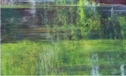
Alain Voinot, “Meditation”
Pastel on black Canson Mi-teintes paper, 25 x 19 in – Detail of reflections.
In “Meditation,” the detail of the reflections highlights Alain Voinot’s skillful use of black paper to enhance the depth and subtlety of his work. The black paper subtly peeks through, particularly in the shadowed areas, adding a sense of natural darkness and mystery to the scene.
By allowing the paper’s base to show through, Voinot creates an interplay of light and shadow that feels both delicate and rich. This technique emphasizes the reflective qualities of the water while maintaining the intensity of contrast, making the reflections appear both vibrant and grounded in the darker tones beneath.
Alain Voinot, “Meditation,” pastel on black Canson Mi-teintes paper, 25 x 19 in – detail of trees. Very naturally, the black of the paper serves me to highlight the trunks of trees. Just put the paper in reserve (as one does in watercolour to save the whites).
The Artist’s Interpretation of Reality
An artist never simply replicates “reality”; instead, they offer an interpretation shaped by their unique sensitivity and perception. When this interpretation resonates and is recognized by others, that is when a painting truly succeeds.
Nature itself is a master of artistry, effortlessly producing stunning works that captivate the eye. In fact, the concept of “chance” in nature is far more intricate and layered than we might think. For me, nature is the ultimate source of inspiration, always offering endless possibilities for creativity and expression. Its beauty is both spontaneous and intentional, and it serves as the wellspring from which all artistic exploration flows.
Alain Voinot, “Little Yellow Place,” pastel on Canson Touch, 25 x 19 in
Thank you so much, Alain, for generously sharing your creative process, ideas, and beautiful work with us! Your insights into working with black paper are truly inspiring.
We’d love to hear from you! Do you create landscapes on black paper? Or perhaps you avoid using it altogether? What do you think about Alain Voinot’s incredible ability to work with black paper? Were you surprised by the effects he achieves? Please share your thoughts by leaving a comment below!
