I’m absolutely thrilled to introduce an artist whose landscape work has long captured my admiration. Barbara Jaenicke has been featured in my round-up, and it’s easy to see why—she’s a true master of subtle color shifts, temperature dynamics, and delicate edge work. Her paintings are beautifully designed, yet radiate a quiet strength that contrasts with the gentleness of the landscapes she portrays.
If you’re not already familiar with her work, you’re in for a treat. Take a peek and discover the magic for yourself!
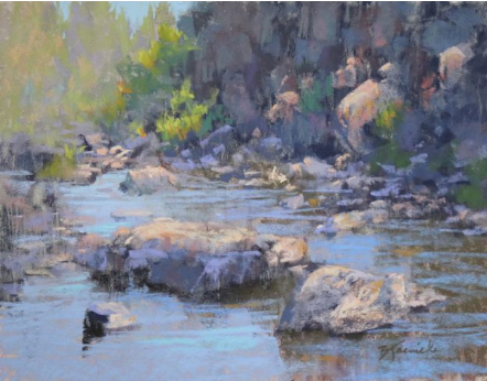
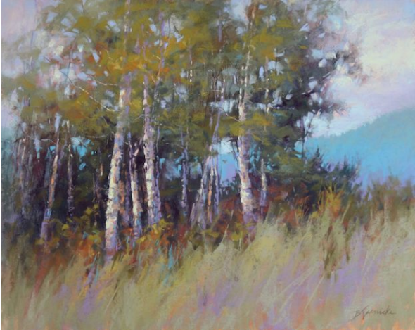
Barbara Jaenicke, “Dancing Light on the River Rocks,” 2019, pastel on UART Premium Board 320, 11x14in.
Before we dive into Barbara Jaenicke’s inspiring blog post, let me share a little about this talented artist…
Barbara Jaenicke Bio
Barbara Jaenicke has been a full-time artist since 2002, and she continues to captivate audiences with her incredible work. Not only does she create stunning pastel and oil paintings, but she also shares her expertise by teaching workshops across the United States and offering monthly online lessons. In addition, Barbara has created several instructional videos for pastel and oil techniques, with a new video on painting snow scenes currently in the works!
Now here’s guest blogger Barbara Jaenicke!!!
~~~~~
A strong design at the start of a painting allows for a better finish.
Most of my favorite landscape paintings by my favorite artists are those that depict the landscape with a well-edited approach, leaving many areas merely implied, yet the completed image still visually reads as a genuine, realistic capture of the landscape.
As I’ve studied the work of these artists and developed my own skills over the years, I’ve realized that the initial setup of the underlying composition for such a painting is key. My goal must be to pare down the initial composition to an arrangement of just a few shapes that vary in size. This initial process requires me to see my subject in terms of an abstract design before I begin to define the particulars of my subject.
Although my interest in painting has always focused more on representational artwork, not abstract artwork, I’ve eventually come to realize that a strong abstract foundation is crucial to any painting, no matter how realistically the subject is portrayed.
Keeping it loose at the start
Besides this initial set up of the underlying shapes, how I handle edges in this early stage is also important. By keeping the majority of edges loose and vague in the underpainting, I’m then able to later selectively choose edges to define. I create strong edge contrast and allow some areas of the painting to remain subdued.


The pastel medium is especially ideal for creating such a loose, edited block-in approach for a painting. Although there are many great methods to start a pastel painting, the method I’ll show and explain here is my personal favorite because it works wonderfully to create those loose, vague (and drippy!) edges, but still allows for setting up distinct initial shapes. With this approach, I can avoid over-defining too much detail at the start, which can otherwise result in a stiff, rigid, finished painting.
In my earlier years as a pastel artist, I found that it took quite a bit of practice and discipline to allow the looseness I needed in my initial underpainting if I wanted a loose, painterly feel to the finished painting. My tendency was to define specifics of the subject matter too soon, rather than prioritize a strong initial design. As I refined my pastel underpainting approach, I was able to strengthen my paintings overall, especially in terms of the more edited capture of the landscape that I’m always after.

Considerations for underpainting color choices
My favorite pastel underpainting method these days is to begin with only 3 or 4 hard pastels (usually NuPastels). One or two are usually a bright mid-value pink, orange, or yellow; a dark-value blue; and sometimes a violet that’s just a slight bit lighter in value than the blue. Occasionally I’ll use a warmer temperature for my darkest or middle value (such as a reddish-brown), instead of the blue.
The specific colors I choose for the underpainting are based mostly on value and temperature, but also sometimes on setting up a dramatic contrast with colors that will later be placed on top. These few colors are all I need to lay in an edited assortment of shapes, values, and temperatures. I can of course vary the pressure of how I lay in the pastel coverage, which will also adjust the specific value.

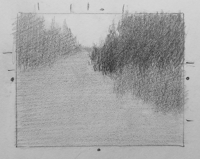
It all begins with the thumbnail sketch
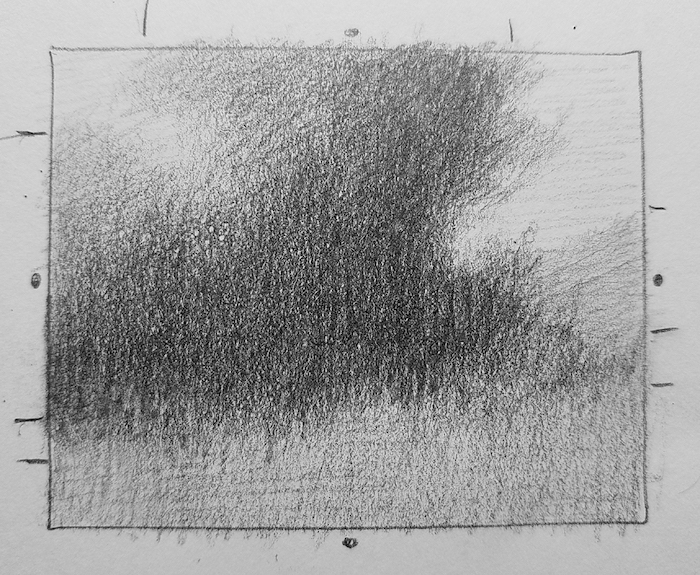
For any studio painting, I always begin with a thumbnail sketch. This is a crucial step, since it’s basically where I figure out the painting. In my sketch, I whittle down the shapes to about 5 -7 shapes. I squint at my subject to do this. I often shoot for a shape hierarchy, in which I have one large, dominant shape, and an assortment of other shapes in descending sizes.
To create this ideal shape assortment, I may need to combine similar-value subjects within my landscape to form one shape, even though they may be unrelated subjects. I also want to establish an overall edited range of only 3 – 4 values at this early stage. I generalize the value for each particular shape, ignoring the many value shifts within the shape, going with the prevailing value I see when I squint. In some cases, I may allow a shape to gradually fade from dark to light (if that’s how my subject appears when I squint), but otherwise each shape is a solid, flat shape at this stage. Defining form comes in the later stages.

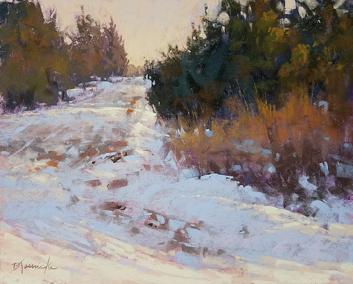
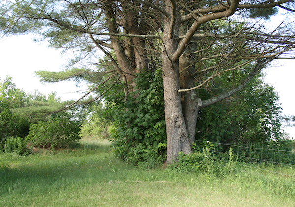
Reference photo, thumbnail, and final painting – Barbara Jaenicke, “Well-traveled Back Road,” 2019, pastel on UART Premium Board 320, 11x14in. Sold
In the following examples, you can see how I edited and composed my landscape subject in the thumbnail on which the painting was based. Notice on the thumbnail sketch how I’ve placed center marks and tick marks along the border so that I could deliberately vary the sizes of my shapes for an ideal assortment of shape sizes. Also notice how I created the thumbnail sketch to the same height-to-width proportion as my finished painting size, rather than the size of my reference photo.


Reference photo, thumbnail, and final painting – Barbara Jaenicke, “Clustered,” 2019, pastel on UART Premium Board 320, 11x14in. Sold


Reference photo, thumbnail, and final painting – Barbara Jaenicke, “Just Before Spring Thaw,” 2019, pastel on UART Premium Board 320, 11x14in. Sold
How I used this approach to create “September Aspens”
I painted a version of this image on location (in oil), where I initially established the basic composition that I used for the studio pastel version.

Back in the studio, I took my time to more clearly define and edit each shape in a thumbnail sketch, and determine a generalized value for each shape. I prefer using pencil for my thumbnail sketches so I can more carefully control how hard or soft my edges should appear.
At this stage, I’m focused primarily on a strong abstract design of shapes and value structure, not subject matter.

Reference photo and thumbnail for “September Aspens”
I begin by blocking in each shape with the hard pastels using fairly light pressure for most areas, allowing a little heavier pressure for the darkest shape. I allow for some edge variety at this stage, but I usually keep the majority of edges very loose and vague. In other words, I allow for a long, gradual transition from one shape to the other, so that, up close, it’s not readily apparent where one shape ends and the adjoining shape begins. However, if I back up (or snap a quick photo and view it shrunk down in a thumbnail size) the shapes are still very clearly defined.
With a #6 flat bristle brush, I then wet down the block-in with isopropyl alcohol. The manner in which I hold the brush is important for how I approach this stage. I hold the brush far back toward the end of the handle and allow the skinny side of the bristles to touch the surface. This allows me to merely coax the alcohol in the direction I wish it to move, rather than using tight strokes on the flat side of the brush, which will create rigid edges rather than the loose, drippy edges I’m after. I also make sure to load plenty of the alcohol onto the brush to encourage drips, allowing one shape to drip right into an adjoining shape, which loosens the edges even more.
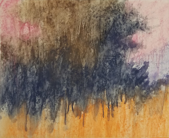
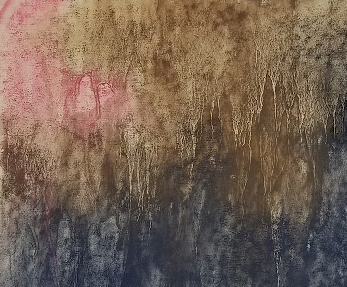
By setting up my underpainting in this way, I now have a foundation of an abstract design with which I can pick and choose areas to define, and allow less important areas to appear merely implied.
In the initial stages on top of my underpainting, my goal is to gradually define the value, temperature, and chroma of each shape. I move around to each area of the painting and focus on these important considerations much more so than defining detail. I also begin to break into my largest shape to begin to further define that shape. I’m paying close attention to shape variety as I address the smaller shapes within this large shape.

As I begin to define the specifics of the trees, I address the variety of hard and soft edges, and the variety of tree trunks sizes, the spaces between them, and the varied angles for each one. I’m also careful to maintain shape variety with all of the surrounding shapes, making sure each shape is slightly varied from the others.
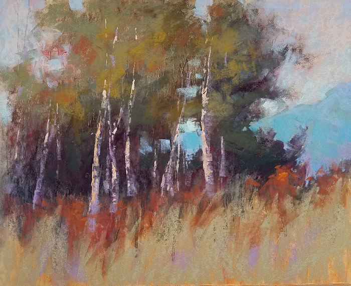
Little by little, I continue to define each area. I create varied-sized negative shapes within the tree foliage, and subtle temperature shifts throughout.

In the final stages, I push the local color of the grass and foliage so that it reads more closely to the actual color of my subject.
This particular painting relies quite a bit on edge variety, so as I complete the painting, I’m careful to observe that the edges throughout the painting are defined appropriately for the particular subject matter, and many less important areas of the painting are left with very little definition, allowing some of the original loose edges from the underpainting to remain visible. I also want to make sure that the initial shapes established in my underpainting are still very visible, even with the subject matter now defined.
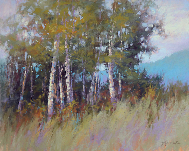
Observing the underlying abstract design in a finished painting.
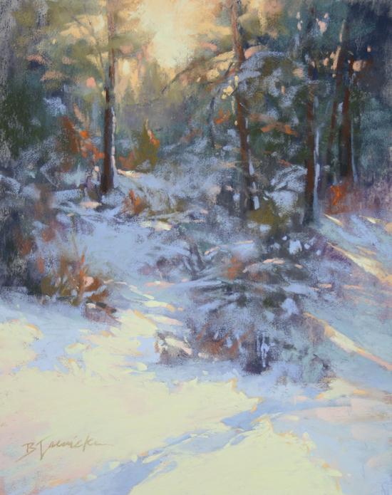
We usually only squint when looking closely at our subject, and keep our eyes opened wide when we observe our painting. But if you squint lightly at a finished painting, you can often see the underlying abstract design that the artist used as the painting’s foundation. If you squint lightly at all of the paintings shown throughout this article, you should be able to see that initial design. See if you can see the underlying foundation in these two paintings below.


*****
Wow!!! Was I right or was I right??? Amazing huh??
Barbara and I would both LOVE to hear what you think of her blog and work so please do leave a comment. If you have any questions, go ahead and ask!
And that’s it for now 😊😊
Until next time
~ Gail